





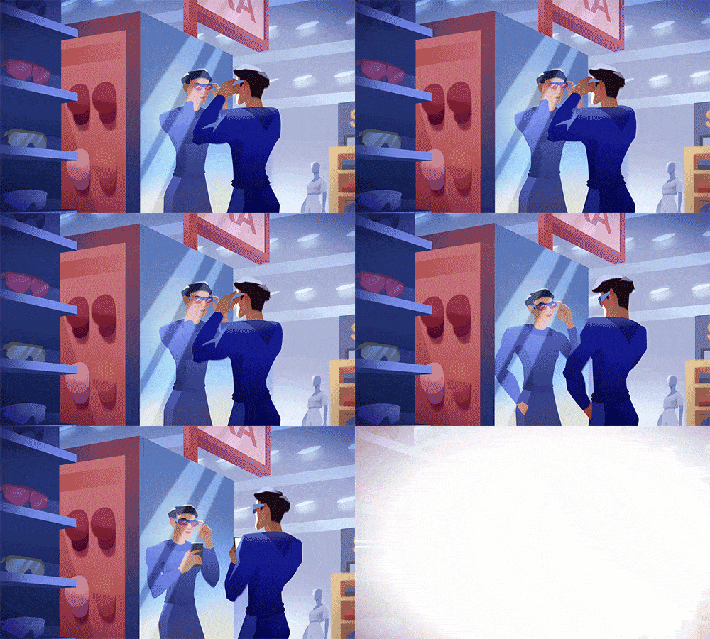
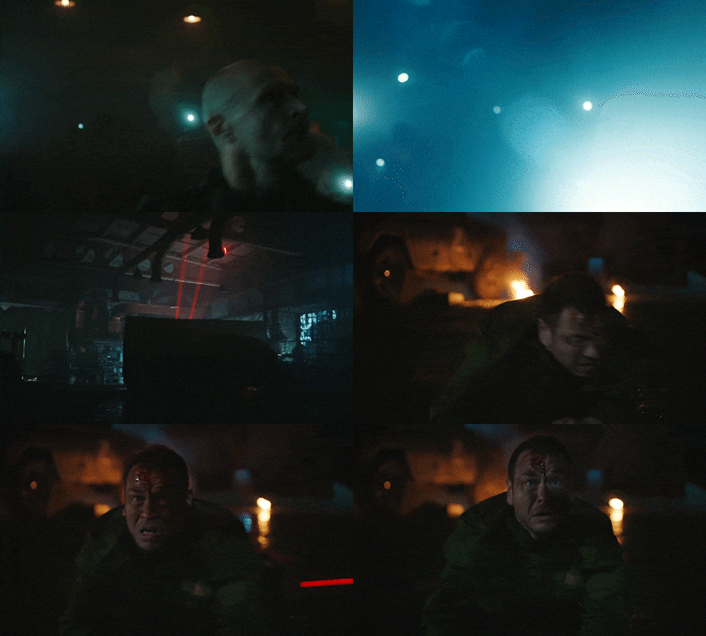

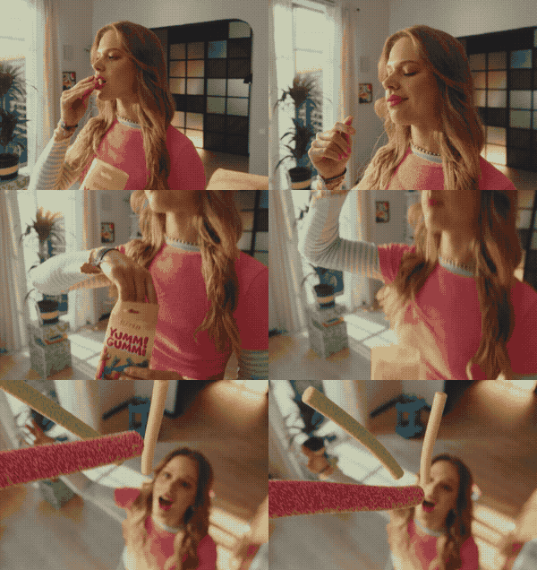

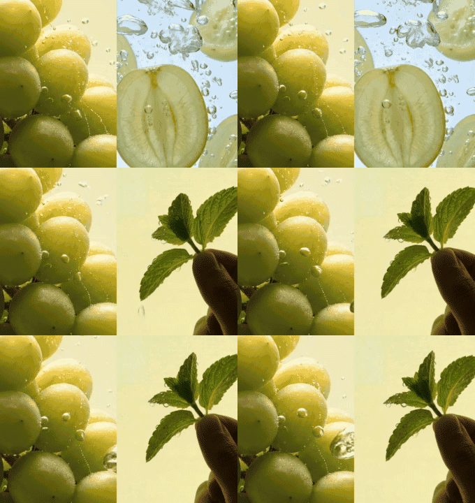
A star identity for NO STARS
identity

NO STARS is one of the most progressive video production companies in Ukraine.
They shoot commercials, they shoot music videos, and they shoot them great.
They burst into the world of shoots in 2016, starting with small clients. Eight years later, NO STARS has leveled up beyond recognition and now works with the country’s biggest companies. But the identity stayed the same as at the start.
So, our task was to create a visual style—one that was fresh, functional, and reflected the production’s new spirit.


We started with analysis
There are plenty of strong players on our market who have worked with the biggest brands in Ukraine and the world. Small projects for no-name brands don’t excite them much anymore, so they do them on autopilot, without much passion. But some, despite all their experience, still have that fire in their eyes, whatever the type or scale of the project.
NO STARS is one of them. These people genuinely get a kick out of sweating the details. So they sweat every stage, to enjoy it even more.
And we made this trait the heart of the new branding.
NO STARS is one of them. These people genuinely get a kick out of sweating the details. So they sweat every stage, to enjoy it even more.
And we made this trait the heart of the new branding.

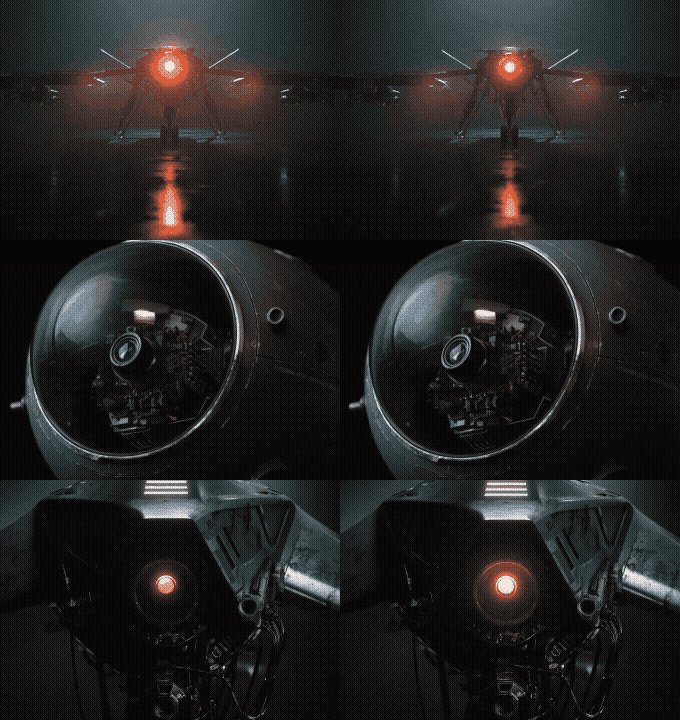
The key element of the identity became a crossed-out star. It’s the endless chase for a perfection that doesn’t really exist. That’s why the drive toward “wow” never stops.
The stars can be any six-pointed object, or anything that looks like one. They also do lots of extra jobs: a standalone hero object, a texture or a frame for an image.
Logo
NO STARS is a recognizable brand, so we didn’t change the logo drastically. But we sharpened its character by cutting the rounded outer corners of the letters, and made layout versions for different uses.

We added a few bright colors to the monochrome palette. The rule: two dominant colors together with black and white.

We picked typefaces that are professional, simple and clear. Oswald for headlines and Onest for longer text.

identity in use
Presentations and documents are one of a producer’s main languages. So the new style had to be convenient and clear for both the team and clients. Before designing slide and doc templates, we studied every type of material to improve how people use them.
from thousands of papers to one qr code

Then we went for the ultimate goal: moving thousands of shoot printouts to digital.
So we designed a mini website for shoots, accessed via a QR code on the badge. Everything you need is there: the shooting plan, the call sheet and, most importantly, the catering menu.
We also added a couple of fun features so clients don’t get bored during setup changes.
and of course, merch
The kind you’re comfy in on set and never want to take off afterwards.
The rubber NO STARS patch is universal. We make it once and then pair it with a printed slogan. That way we brand all the merch.


